
I started the Custom Card Contest after Untap Open Leagues decided to do a one-time contest for an anniversary event. I was a Wizards of the Coast Great Designer Search 3 candidate, and got only two questions wrong on the test. I had a huge passion for card design and game design more broadly. I brought that into what became widely regarded as one of UOL’s most fun, best-run leagues. This is praise I take to heart, as I worked hard to start CCC into its success, and Swonk, the current person in charge, did a fantastic job in his first season running it.
CCC is both one of the most open leagues and also one of the most subtly competitive. On the surface, anyone can step onto several sites to make a card, slap it into the form, and voila, you could win the round. Do it enough, and you could win the whole event. However, this has never panned out, just as stepping into a competitive format with a bad deck and no experience is unlikely to lead to success.
So here’s a few tips, tricks, and pointers to maximize your chance to make it to further rounds or possibly win the event or Best Design.
Learn the Basics
This may seem like an obvious one, but learn a few basics of card design. Know what is in the color pie, both from the official sources and from the more updated, but less official sources. If you submit cards that are out of the color pie, people will notice and be less likely to vote for you unless the break is incredibly flavorful. And I do mean incredibly flavorful. Think High Tide, Darkness, and similar levels of absolute flavor over pie function.
Learn the basics of wording, and keep up to date with the latest changes. I’ve seen a few people still using “his or her” instead of “them,” “shuffle your/their library” vs “shuffle,” etc. It not only helps you stand out by reading well, but it also frequently means you save on lines.
Learn the difference between multicolored and hybrid cards. I see a lot of cards that are multicolored or hybrid that don’t need to be or aren’t hybrid. A multicolored card should take aspects of both colors and put them together or take an area of overlap between colors and enhance it. A hybrid card should be a card that would be sensible to print as a monocolored card in both colors it’s a hybrid of. If a card could be monocolored, making it multicolored doesn’t make sense. Then if it’s a hybrid, you need to be extremely careful about what elements of the pie you utilize.
If you have questions, ask. Both Swonk and I are usually good at bouncing ideas off of, and asking for help with wording or making something work is not just ok to do, but welcomed.
Finally, be open to critique. We do enforce critique being constructive, but we encourage critique of cards generally. If you take critique to heart and strive to improve, you’ll end up seeing better results naturally.
Design Sensibly
Learning to design in a sensible, straightforward way will help you get far.
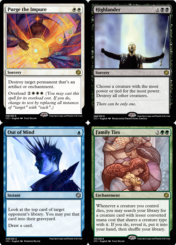
Pay attention to how many lines you have. More lines on a card not only makes it harder to parse from a voting standpoint, but also frequently indicates a card is doing too much. Let’s take a look at two cards from CCCs past that have used simple templating to deliver powerful results.

Look at both these cards by Viperfang and CirculΔr respectively . Would either be as powerful on an emotionally resonant level if they jammed on other text? They are undeniably powerful spells, but part of what makes both work well is their text boxes being simple, minimalist, and straightforward. That’s not to say that you can’t utilize more text to a great effect, however.

This is a card from a personal set I’m working on. It has seven lines of text, which is approaching the limit before a card will start to need smaller text. When you read this card, however, it’s fairly straightforward. These seven lines boil down to only three sentences, one of which is a reflexive line if you’ve played this game for any amount of time (shuffling after searching). Compare that to one of my early attempts at a card from 2015.

This is hideous to look at, and I hate that I once made this. There are eight lines of text over six sentences. While it’s got some power to it, it’s also just so dense with text that your eyes slide right off of it. This was a card I made right after I discovered Magic Set Editor, and it shows. Not only is this doing a lot, not only is it disconnected, but it also fails at utilizing another great tip.
Utilize Piggybacking
Piggybacking is one of Mark Rosewater’s concepts introduced in his award-winning Game Developers Conference. The full talk, 20 Years, 20 Lessons, is highly worth your time.
The basic idea of piggybacking is that people come with preconceptions about how some things work. Zombies are slow and often hard to kill. Electricity is fast but dangerous and ephemeral. King Arthur uses a sword called Excalibur and is on a quest for the Holy Grail.
By tapping into things that people already know in what you design, you can create cards that really tap into something people attach to. For instance:

Endangered Species by Masinmanc is from the first season of CCC. It takes a concept (a species in danger of vanishing from the earth) and melds its mechanics to fit that idea (the creature literally has vanishing, but you can stop it if you take the right actions). For another example, Peasant Levies is another card from my set. It takes the cards’ name (a term meaning to take peasants and press them into military service) and matches the expectation (by making a number of relatively low-powered Soldiers).
When you utilize piggybacking, you drill into a part of human psychology where familiarity equates to understanding, which can equate to value and therefore preference. Preference in this case can turn into votes or best card designs. This also means that rather than trying to design a legendary creature of your own making, I’d suggest trying to find an existing character from Magic or outside of it that you can lean into to draw the flavor from. You’ll have more success that way.
Simplify
Something that all the cards I’ve showcased positively until now have had in common is that they’re simple. Simple cards have a number of advantages when it comes to success in CCC.
For starters, the cards look better. The low text count makes the text box look clean and streamlined. Cards that look better can easily become cards that fare better in rounds. This is also why I’d encourage people to download Magic Set Editor and get all of the updates for card frames. MSE does a better job at looking like real cards.
Simple cards are also easier to read and understand. If people run into a card that has tons of text (such as my green monstrosity above), they will be less inclined to read it. If they’re comparing two cards, they’re more likely to lean towards a simple choice versus a complex one.
Finally, simple cards tend to be easier to find art for. If you make a card that’s simple, straightforward, and to the point, you’re likely able to find art that matches it. This is doubly true if you’ve utilized piggybacking.

Dance in Solitude was our Season 2 Best Design, won by Glas, and it married a simple effect with a piggybacked name, and found a beautiful and poignant art to fit it as well. You can feel the romance in this card, and it absolutely smashed it out of the park on every metric.
Be Complex When Needed
Not all of our best cards have come from just simplicity either. One of the most well received designs, and Season 1’s Best Design, was Procrastination by Draiu.

This card is doing a ton. It’s a Suspend-only card, a Storm card, and has an effect that modifies when the time counters from suspend are removed. That’s a lot and yet by leaning into the piggybacking of procrastinating and letting the text be as complex as it needs to, the card was a huge hit. When a card wants or needs to be a bit more complex, let it be that. While simplicity can be a great tool, not every card or situation needs to be simple. Some need to be complex.
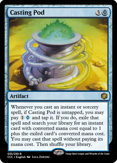
Casting Pod by Swonk riffs on Birthing Pod, and it needs to be as complex as it is to accomplish that goal. Eight lines of text over four sentences with Phyrexian mana and a trigger is a lot to take in, but it’s necessary to make the connection and to make the card function.
Find Good Art
One of the reasons we emphasize the art so much in the signup sheets and also in the rules is that art can really make or break a card. I very much highly recommend ArtStation, which is a site used by professional and aspiring professionals to share their works. It has a consistently high bar for quality and a ton of talented works to draw from. You can also use DeviantArt, though that tends to have more hobbyists than professionals. If you know a specific artist from Twitter, Instagram, or the like, their websites can be a great resource.
I would also advise against Google searching. It can work as a last resort, but it frequently leads to a lower quality of work or to trouble with sourcing the artist of a piece. The number one issue I’ve had when trying to track down an art credit for Cube includes has been from people using Google Images. If you want a historical piece, this is an alright starting point, but I would absolutely otherwise recommend any other method over it.
The kind of art you use can have a large impact on how people perceive your cards.

CirculΔr designed quite a few cards, including a cycle, with art from Julie Dillon. Dillon is a great artist that has a distinctive style. Her art on its own can inspire you to create cards around it, while the consistent style she employs is able to make for great bases for cycles. Finding an artist with a consistent or unique style opens up designing from the art itself.
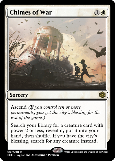
If your card has an action in the name or card text, try and match that action in the art. In this case, the chime is clearly represented with the bell and birds taking flight. Even better, the children excitedly running up and knight in the midground clearly indicate the arrival of someone. This set SharpMax’s card over the top of its simple mechanics.

If you have a land, make sure the focus of the art is the landscape itself. While you can have a figure present, try and make sure the figure is secondary to the landscape. Here, Chebokha included a figure, but the position of it draws the eye further into the frame and towards the tunnel. The use of light and dark also help draw the eye away from the floating boat. All of the lands Swonk designed from this cycle feature great art that really focuses on the land.
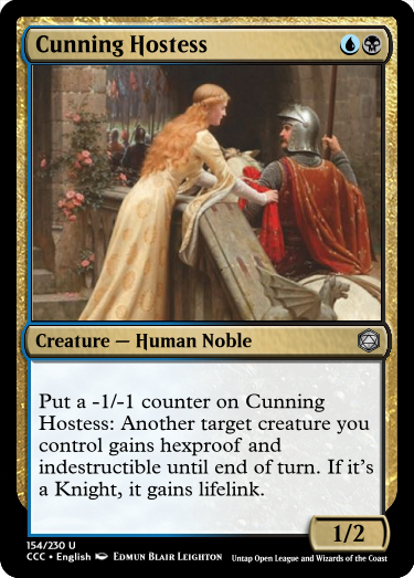
When you incorporate a character, either as a creature or a planeswalker, make sure to have that character be the focus. Again, this should be sensible, but it has slipped by people before. Here, we have two figures, but the painting by Leighton chose to focus on the woman. The railing here creates a divide between the two and our viewpoint being on the same side as the woman places the focus onto her. This classic painting was a great choice to use by cheeseypuffy.
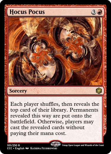
Try and match the feel of the card itself with the art. Hocus Pocus is a hugely chaotic card by Ajax, and the art by Feudkowski matches. The dizzying swirls of color with a few sharp lines create a pattern that’s hard to match. Compare that to the mood of Cloudbound Causeway above, which uses cool colors and softer shades to achieve a much calmer atmosphere for a calmer card.
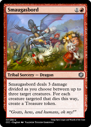
Finally, don’t be afraid to let your card get goofy with the art. Gorynycj’s art here combines with a pun in the name to deliver a whimsical yet powerful card. While this effect could be printed on a much more serious card, the whimsical take by Draiu actually works better overall.
Choosing the right art can take a design that’s an 8/10 and jump it to a 10/10 status.
Practice, Practice, Practice
One of the things I would do when making the challenges for CCC is to make 5-7 cards per prompt, preferably one per color and a colorless where applicable. This had two beneficial effects. One, I could be sure that the design space in each challenge wasn’t limited too much. Two, I ended up making a lot of cards. Hundreds of cards, in fact. Hundreds on top of the hundreds I was making in my spare time, for fun.
This practice means that, while I may not always be the most outstanding designer ever, I have a great sense for how to pull things out of an idea. I’ve made a lot of bad cards in my time, a lot of cards that I didn’t like. I’ve made a few that I did like, a few that were really clever or cool. But I’ve learned how to take a challenge and break it apart and look at how to find a good way to match that challenge. A lot of our other great designers do this.
CirculΔr, who’s won both a season and Best Design, has a knack for this.
Stoneforged, another Best Designer winner, is also someone I suspect practices a lot. Their designs are consistently solid, and they’ve placed in the finals of every season they’ve competed in.
The best way to really take these tips and lessons to heart is to practice with them, internalize them, and get them to be second nature. The less you think about doing the above and the more you naturally do them, the better off you’ll be.
Have Fun
Finally, have some fun. Do some wacky stuff. We have unofficially made ‘Sexy’ a creature type after our Valentine’s Challenge went… awry.
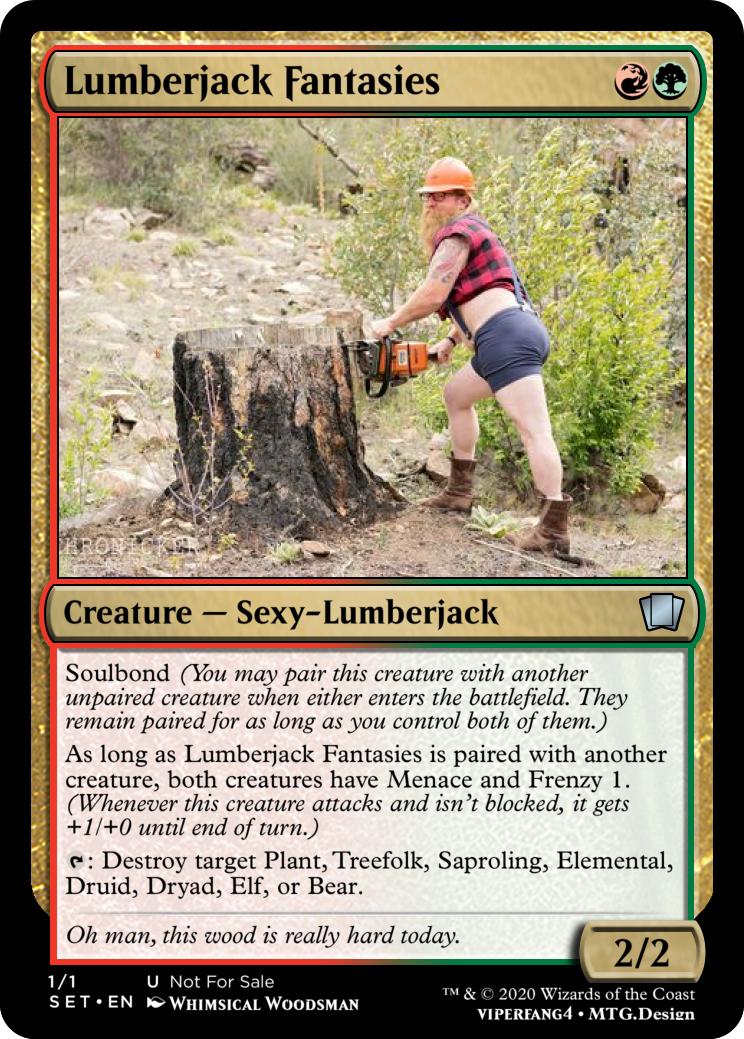
Thanks Viperfang.
If you design a card that you think would be fun, it’s more likely to do better. You’re more likely to zero in on a part of the game that others enjoy as well as you, and do better as a result. Plus, the whole point of the Custom Card Contest in the first place is to have fun while making cards. Enjoy yourself.

